


Corporate brand
appearance guide
Introduction to the Hans Weber Maschinenfabrik style guide
This digital handbook forms the basic framework of the WEBER brand. It provides guidelines for communication and thus guidance for the use of internal and external materials that represent the company. The image and image of the corporate brand depends on a uniform appearance on all communication channels. This applies not only to the channels maintained by marketing, but also, for example, to customer presentations from sales, business letters or the company's own e-mail signature. The basic principles of design therefore apply to every single employee in the company. In addition, this manual also provides a framework for partners, sales representatives and external stakeholders of all kinds who communicate with the WEBER brand. The following applies to external stakeholders: Before using and publishing the WEBER logo and style elements, consent must be obtained via marketing@hansweber.de.
Communication and use of language
Our communication is characterized by objectivity, precision and professionalism. We always strive to communicate clearly and directly to avoid misunderstandings and ensure that our messages are conveyed effectively.
Choice of words: We use clear and direct language that makes it possible to convey complex content in an understandable way. Technical jargon is used selectively to convey precise information and only when it is necessary for understanding. We make sure that the technical term is always explained in context to avoid confusion.
Salutation: The form of address depends on the respective medium and situation. In formal contexts or written communications that require professional distance, we always use “Sie”. In less formal or personal forms of communication, such as in internal teams or social media, “Du” may be appropriate, although we always make sure to address people respectfully and appropriately. The choice of form of address is always made taking into account the relationship with the addressee and the communication situation.

Brand name: The correct spelling and use of the company name is essential for recognition in text-based communication. The first time the company is mentioned in a text, the full company name should be used. For subsequent mentions, you can then switch to the abbreviated form. The following spelling is important:
+ full company name: Hans Weber Maschinenfabrik
+ short form: WEBER (Important: No lower case letters)
Claim
innovation. quality. partnership.
The claim “innovation. quality. partnership.” complements the brand name and conveys the values of the brand identity. The period must be placed after all three terms, even if the claim is not at the end of the sentence. When using the claim, the company WEBER or Hans Weber Maschinenfabrik must always be mentioned or the logo used.
The claim reflects the values of the family business and is therefore part of the corporate philosophy.
innovation.
Pioneering technology
“innovation.” stands for the combination of decades of experience and a constant focus on the future. Thanks to our proximity to the market and to our customers, we are not only familiar with market-relevant issues and wishes, but also very individual ones, and we respond to them. In doing so, we use our expert knowledge, which has been developed and strengthened over the last 100 years. We not only build on tried-and-tested fields of application, but are constantly expanding our range of products and services towards the future.
quality.
Our demand for quality
We want our products to impress in the long term. This high quality standard is reflected in the continuous research and development that we put into our products. As a company, we feel we have a special obligation towards the environment. Accordingly, the issues of sustainability and resource conservation are of great importance to us.
Our vertical range of manufacture is almost 100% at our site in Kronach, Germany, which is associated with a certain promise of quality to our customers.
partnership.
Long-term partnerships
We maintain close contact with our customers. This constant exchange is important to us. The customer and their requirements are our focus right from the start of development. We strive for long-term partnerships with our customers that are characterized above all by trust and reliability. In addition to sales and technology, this partnership also includes service.
Logo variations
Primary logo: The primary logo is the standard version of our brand and is used in the defined typography and color combination. It displays our company name in the originally designed font and color palette that best represents our brand identity. This version should be used in most cases to ensure consistency and recognition. The design and placement of the elements are carefully coordinated to ensure a harmonious and professional appearance.
Inverted version: The inverted versions of our logo are designed for use on dark or strongly colored backgrounds. In these versions, the logo is adjusted so that it stands out from the background by reversing the colors. These versions ensure that our logo remains legible and visible in low contrast conditions without losing design integrity.
Download WEBER inverted white Download WEBER inverted white-blue
Spacing: The logo is always placed at the bottom right of the document and is always provided with a subline. A distance equal to half the width of the WEBER-W must be maintained on all sides. The logo is always positioned at the same angle as the W-Inclined WEBER logo, i.e. a 5.5° angle
The subline must be omitted in two cases: 1. the height of the overall logo with sublime is less than 14 mm. Or 2. the positioning of the W-Inclined bevel cannot maintain the all-round spacing.
The space around the document from the edge of the page to the first element must be at least one complete WEBER-W width (without subheadline). It can therefore vary depending on the size of the logo used.
Consistency in the logo scheme: Our logo follows a clearly defined scheme that must always be adhered to in order to present the brand identity consistently. In the primary logo, the “W” is always positioned at the top as the central key visual, making it a strikingly recognizable element. In the logo's subline, “WEBER” always comes first, followed by the specific division, product or other name that clarifies the context. This scheme ensures that the logo remains consistent and recognizable. The exception is the “WEBER overall logo”, in which the complete company name HANSWEBER Maschinenfabrik is firmly defined in the subline.
Logo variants by division
We see ourselves as a company that operates internationally. As a consequence, the titles of the divisions have been changed to English. In addition, each division now has its own logo, which is derived from the WEBER umbrella brand in terms of its visual appearance and thus once again ensures the corresponding recognition value. The division names are not only binding in the use of the logo, but should also be used in text-based communication of any kind, for example in presentations or descriptions of the company or division.
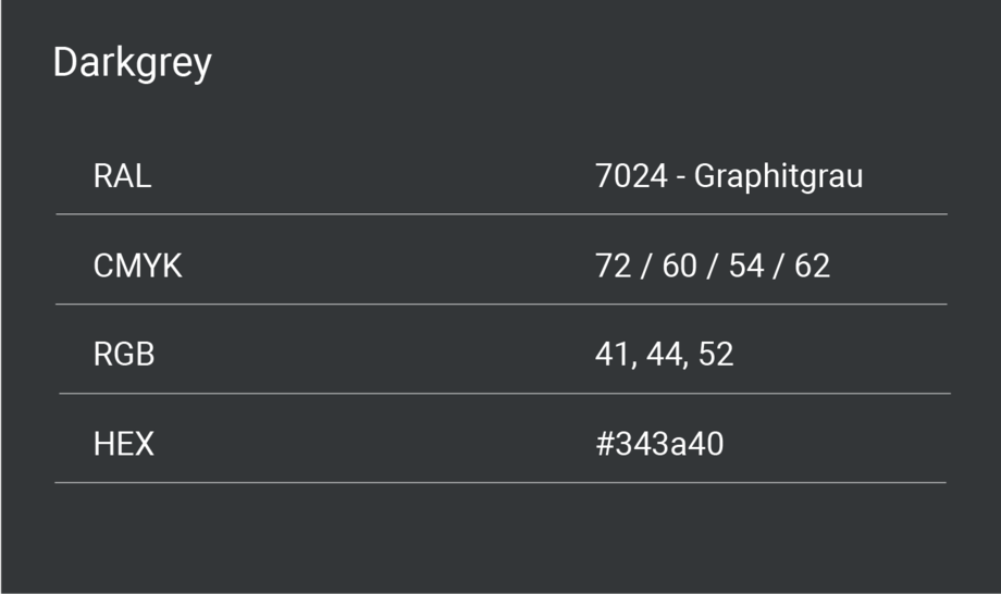
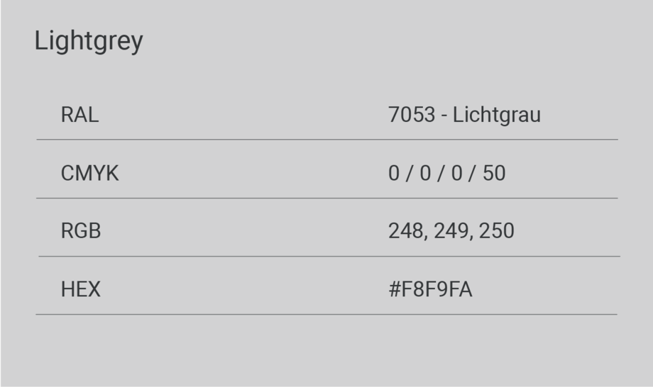
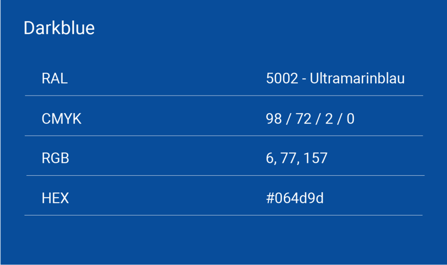
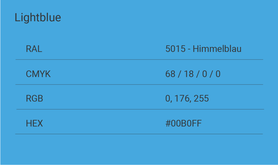
Colours
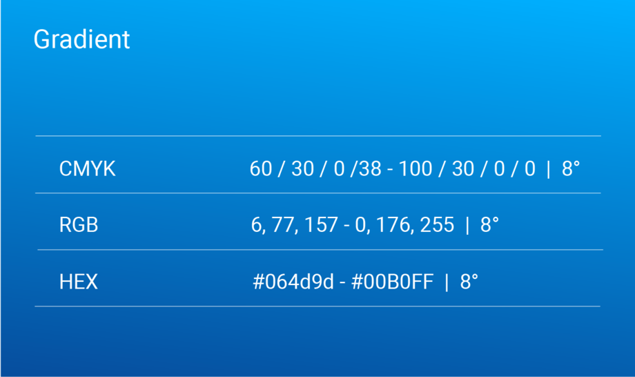
The color world of the WEBER brand is reduced to 4 essential basic colors. Exceptions to this rule are psychological color associations (e.g. error ~ red).
Gradient: The gradient is made up of the basic colors dark blue and light blue at an 8° angle. The gradient is a spot color and is only used to highlight letters or the Weber slash.
Typography

ROBOTO is the corporate font of WEBER designed by Christian Robertson.
It functions as a font in both analog and digital media and can be obtained at any time via the Google Fonts database or this system. The fonts are designed according to the hierarchy of the text. The rule of thumb behind this is: the higher the hierarchy (larger), the lower the font weight (thinner). The font styles 100, 300, 400, 700 are available.
Font and graphic design
Headings are always designed in light font in accordance with WEBER's corporate design. Medium font may also be used to emphasize individual words. However, never emphasize more than 50% of a headline, but rather only individual words. Headlines are always double-spaced, so they must be written with enough words for the graphic implementation.
Multi-line headings are indented in the subsequent lines compared to the first line. The angle of the indentation corresponds to the angle of the WEBER slash in the logo. In most cases, a space can be used for indentation.
Headings are written with a mixture of upper and lower case letters according to spelling and not with capital letters throughout (versal). The only exception here is the brand name WEBER, which is always written verbally, i.e. in capital letters.
The font size of the headline can be chosen freely in order to create the most attractive overall image. The following applies: The size of the headline serves as the basis for the sizes of the sub-headlines, teasers and body texts. The font sizes of the other elements are derived and calculated based on the selected headline size (see corresponding section).
Line spacing is always set to 120% for headlines. The line spacing can be calculated using the following formula: Value font size headline/100*120
Sub-headlines can supplement a title heading. They are placed below the headline.
The medium font is always used in full for sub-headlines.
The font size always depends on the font size of the headline. To calculate the correct size, use the following formula: Heading font size value/3.36.
Teasers are written in regular style. No individual words may be emphasized.
The font size is calculated from the font size of the headline. Use the following formula for the calculation: Heading font size/2.4
The line spacing must always be 160%. The spacing is calculated as follows: Value font size teaser/100*160
Continuous text is always in light style. Medium is used to emphasize words, but this should be used selectively and therefore sparingly.
The font size of the body text is always calculated from the font size of the heading. The following formula is used: Heading font size/3.36
The line spacing for body text is 160%. You calculate the spacing using the following formula: Value Font size body text/100*160
There must always be a space between two paragraphs that corresponds to the font size of the body text. This is calculated using the following formula: Heading font size/3.36
This spacing also applies between the subheadline and body text.
This spacing within texts refers exclusively to continuous texts or the spacing between headline and continuous text. This does not apply to teasers, as teasers never consist of several paragraphs.
For bulleted lists, a “+” is used to mark individual points.
Rules for continuous text and paragraphs are used equally here and can be found under the respective points.
Bulleted lists are always indented. The indentation corresponds to double the body text font size. When calculating, please note that you have to calculate in millimeters and not in pixels. Use the following formula: 2*(font size heading/3.36)
Big Numbers always consist of 2 elements, a numeric attribute and a short label, ideally only 1 word, but a maximum of 5.
Both elements are designed in regular font.
The font size of the number corresponds to twice the size of the heading, i.e. the following formula: 2 x font size heading
The font size of the label corresponds to the font size of the teaser text, i.e. the following formula: Heading font size/2.4
Highlights only appear on the page of a brochure or on the bottom of the website and are marked by the color blue or a color gradient.
These highlights should only be used very sparingly. The color highlight may only be assigned to a single element of the page.
Visual and formal language
Our focus is on the authenticity of the visual presentation. The visual material should be selected in such a way that it fits harmoniously into the overall context of our company and communicates our values in the best possible way.
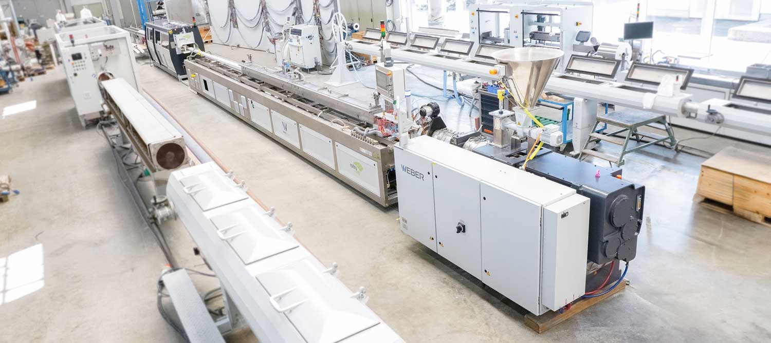
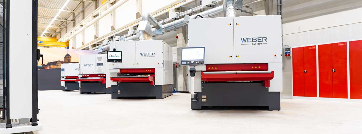
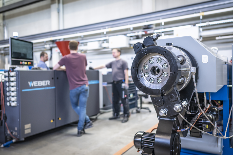
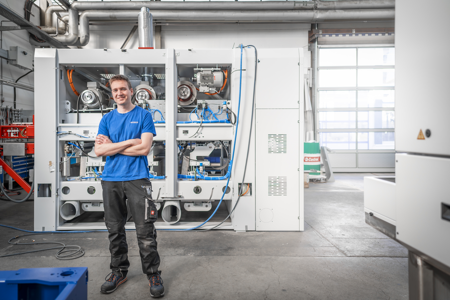
High-quality, industrial photographs or renderings should be used to depict the company's machines, employees and production facilities. Real images from the company's own environment create an authentic and trustworthy image of the working environment. The photos should showcase the technical excellence of the products and processes as well as the people and atmosphere behind the success. Stock photos should be used sparingly in order to preserve the authenticity and credibility of the visual representation.
W-/ (Slash)
Painting for the main heading
As a characteristic style element, the main heading is headed by a slash symbol. The symbol is derived from the diagonal of the WEBER logo and can be easily placed over the type area. For multi-line headings, the offset of the type area should always be set using the diagonal.
W-Inclined
The inclined plane or stage
The W-Inclined forms a visual stage and gives the print or web product a basic shape and stand. Depending on the motif, it is decided whether the W-Inclined should be light or dark. The element connects all marketing products, creates uniformity and offers an ideal place to position the logo, the logo variant or further information.
The gradient of the W-Inclined is 5.5%
Image mask
Pictures in context
If an image is displayed in context with text, a table or in total with several images, it is given an image mask. This crops the bottom right edge of the image at the angle of the W/. This continues the above-mentioned form elements and inclined planes and also helps to create a character feature with which the viewer always associates WEBER, even without a logo.
Still have any questions?
If you have any questions or concerns about the style guide, please contact WEBER Marketing.
